
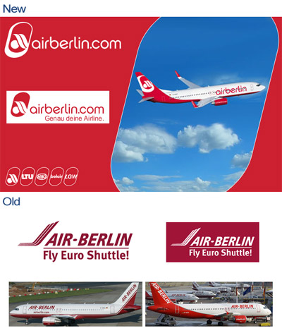
German low cost carrier Air Berlin has come up with a new logo, changed logo type and new slogan.
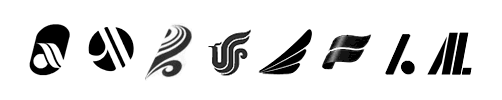
If you ask me (being in media industry for quite some time), it’s one of the worst airline logos ever. The logotype is ok, but the logo is completely tasteless, cheap, un-creative, horrible. Let’s face it, every moderately talented design student could have come up with a better one. What does it symbolize anyway? The sun and a wave? An eye? A passengers head hit by the reclined seat in front? – wow how creative … come on! This logo could even be mistaken for some Asian airline or actually for the logo of the Marriott Hotel Group.
Recognition value?
The new solgan “Genau deine Airline”, translated: “Right your Airline”, as well, is as cheap as the logo itself.
Air Berlin . is . was a known brand and had a high recognition value of its old Corporate Identity.
With the new, totally different looking tail logo they’re destroying their own market recognition and need to establish their brand once again, literally starting by “0”, but this logo won’t help to build a strong brand. I’m predicting that the logo will be changed again, in a time frame of only a few years.
A new logo was definetely needed, but indeed, the one chosen by the company has no meaning and shows a lack of artistic value. Additionally, the current NEW logo will visually clash on the other side of the aircraft with regards to its inclination.
I personally thought that maybe the logo should have been changed to a bear, in resemblance of the Berlin City logo. Even then, the name tends to be too regional. Perhaps changing the name back to Germania or Air Germania would give it a better image against Lufthansa.